
Fonts are more than letters on a screen—they’re the voice behind your message. The right typeface can feel bold, elegant, playful, mysterious, or comforting before a reader even processes a single word. At We Are Fonts, we love exploring how typography shapes mood, readability, and identity, whether you’re designing a logo, a flyer, a school project, or a social post. From classic staples you’ve seen everywhere to quirky symbols that break the rules, fonts help you set a tone instantly. In this guide, we’ll look at popular styles, what they’re best for, and how to choose thoughtfully so your text looks intentional—not accidental.
The Classics: Familiar Fonts and Why They Still Work
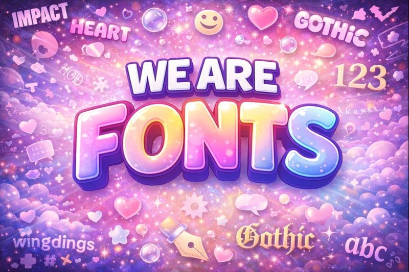
Some fonts become popular because they’re reliable. The impact font, for example, is bold, condensed, and built to grab attention—perfect for headlines, posters, and short, punchy statements. It’s not subtle, but that’s the point: it was made to be seen quickly. Another well-known classic is the papyrus font, often associated with an earthy, ancient vibe. It can be effective in the right context, but it’s also famous for being overused—so it works best when you’re intentionally leaning into that textured, historical feel.
If you’re building basic designs, alphabet fonts are a great way to explore shapes, spacing, and style across the full A-to-Z. They’re also useful for classroom activities, branding drafts, and anyone learning how letterforms affect readability.
Decorative and Themed Fonts: Style With Personality
Decorative fonts are where typography gets playful. A gothic font can bring drama and mood, while an old english font leans into traditional, formal letterforms that feel historic and ceremonial. These styles shine in titles, invitations, and logos, but they can be difficult to read in long paragraphs—so pairing them with a simpler font for body text is often the best move.
For fun, bubbly designs, bubble lettering adds instant friendliness. It’s great for kids’ projects, stickers, and casual branding. If you’re creating something affectionate or romantic, a heart font can add warmth—especially in short phrases or decorative headings.
Symbols, Numbers, and Niche Favorites
Typography isn’t only about letters. Number fonts matter for everything from price tags to scoreboards to sleek product packaging. Some number styles feel modern and clean; others feel playful or retro. Choosing number fonts that match your main typeface helps your design feel cohesive.
Then there’s the world of symbol fonts—like wingding—where characters turn into icons and visual surprises. These are fun for accents, but they should be used carefully so your message stays clear.
You’ll also see specialty styles like a typewritter font, which adds a nostalgic, mechanical feel—great for journal themes, vintage posters, and storytelling designs. And for modern internet culture, people often look for a discord font style to match the clean, chat-friendly look associated with online communities.
Conclusion
Fonts are a design tool, a mood setter, and a storytelling shortcut all at once. Whether you’re drawn to the bold confidence of impact font, the playful charm of bubble lettering, the dramatic tone of old english font, or the quirky symbols of wingding, the best choice is the one that matches your message and stays readable for your audience. At We Are Fonts, we believe the perfect font isn’t just what looks cool—it’s what helps your words feel exactly the way you intended.