
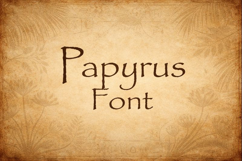
Papyrus is one of those fonts you can spot instantly. With its rough edges, uneven strokes, and “handcrafted” texture, it feels like it came from a scroll, a museum placard, or an old adventure poster. That recognizable style is exactly why the papyrus font became so popular—and also why it sparks strong opinions. Some designers love its earthy, historic mood; others avoid it because it has been used so widely. Either way, the papyrus look remains influential, especially for themes involving ancient history, nature, mystery, or handmade craft. In this article, we’ll explore what makes the papyrus style tick, when it works, when it doesn’t, and how to find alternatives that deliver the same vibe without feeling overdone.
What the Papyrus Style Communicates
The main strength of the papyrus look is atmosphere. A papyrus type font suggests age, texture, and something “found” rather than digitally polished. The irregular edges mimic worn fibers or chiseled marks, which helps create a sense of authenticity. Even if a reader doesn’t consciously think “ancient,” the font still signals something organic, historical, or mystical.
That’s why this style shows up in designs for archaeology themes, fantasy worlds, tribal motifs, nature brands, spa signage, and anything trying to feel grounded and handmade. It can also work in classroom materials about ancient civilizations, where the goal is to set the mood quickly and help students feel like they’re stepping into another time.
When Papyrus Works Best (and When to Be Careful)
Papyrus shines in short bursts. It’s usually best as a title font, logo accent, or a small decorative header. Because of its rough, uneven details, it can become hard to read in long paragraphs—especially at smaller sizes. The more text you set in it, the more visual “noise” builds up, and the message can start to feel cluttered.
It’s also worth thinking about cultural tone. Papyrus often gets used as a shortcut for “ancient” or “exotic,” and sometimes that can come across as generic or cliché. The font itself isn’t the problem—overuse is. If you choose papyrus for a design, do it intentionally. Pair it with clean, modern body text so it feels like a deliberate style choice rather than a default.
A good rule: let papyrus be the spice, not the main dish.
How to Choose Fonts Like Papyrus
If you want that same ancient texture without the exact look, consider using a font similar to papyrus—something with roughened edges, hand-drawn variation, or carved-stroke energy. Many designers search for fonts like papyrus when they want a fresh version of the same feeling. The goal is to capture the mood (weathered, handmade, historic) while avoiding the “I’ve seen this everywhere” effect.
When exploring alternatives, focus on three qualities:
- Texture: Look for subtle ragged edges or distressed effects.
- Stroke variation: Hand-drawn or chiseled fonts often have uneven thickness that feels more natural.
- Readability: The best alternative keeps the vibe but remains clear at the sizes you actually need.
If your project needs a full set of letters for posters, worksheets, or creative titles, it can help to compare the style against an alphabet font set. Seeing the entire A–Z makes it easier to judge consistency, spacing, and whether the style holds up beyond a few dramatic words.
“Free Papyrus Font” Searches: What to Watch For
It’s common to see people search for a free papyrus font when they’re working on personal projects, school assignments, or quick design experiments. If you go down that road, focus on two practical points:
- Licensing: “Free” can mean free for personal use only, not commercial.
- Quality: Some free fonts look great in headlines but fall apart in punctuation, spacing, or readability.
Even when you find something labeled “free,” it’s worth checking whether the font includes clean numerals, quotation marks, and accented characters—especially if you’re designing something professional or multi-lingual. A papyrus-style font that lacks basic symbols can cause headaches later.
Making Papyrus Look Modern and Intentional
If you love the papyrus look but want it to feel fresh, styling choices make a huge difference. Try these approaches:
- Use it sparingly: One strong title can set the mood without overwhelming the design.
- Pair it with a neutral font: Clean sans-serif body text balances the rough texture.
- Increase letter spacing slightly: A bit of breathing room improves readability.
- Avoid all-caps blocks: The texture becomes heavy when everything is dense and loud.
- Choose a supportive color palette: Natural tones often complement the papyrus vibe better than harsh neon.
These small decisions can shift papyrus from “default cliché” to “intentional theme.”
Conclusion
Papyrus remains popular because it does something fast: it creates atmosphere. A papyrus type font signals age, texture, and a handmade story on sight. Used well, it can be a powerful headline tool for history, nature, fantasy, or craft-inspired designs. Used everywhere, it can feel tired. If you’re aiming for that same mood, explore a font similar to papyrus or experiment with fonts like papyrus that keep the spirit but offer a fresher look. And if you’re hunting a free papyrus font for a project, prioritize clear licensing and solid character sets. With thoughtful pairing and restraint, the papyrus style can still feel bold, readable, and purposeful.